
In the contemporary digital ecosystem, where users access the internet through an ever-expanding array of devices – from desktop computers and laptops to tablets and smartphones of varying screen sizes – the importance of a responsive website for Small and Medium-sized Enterprises (SMEs) cannot be overstated. Gone are the days when a single, fixed-width website design could adequately cater to the diverse browsing habits of online users. Today, a website that fails to adapt seamlessly to different screen resolutions risks alienating a significant portion of its potential audience, hindering user experience, and ultimately impacting business growth.
A responsive website is not merely a design trend; it’s a fundamental requirement for SMEs looking to thrive in the online marketplace. It’s an approach to web development that ensures your website dynamically adjusts its layout, content, and functionality to provide an optimal viewing and interaction experience across all devices. This adaptability is crucial for engaging users, improving search engine rankings, and ultimately driving conversions and revenue.
At VeCar Digital Programming, we understand the unique challenges and opportunities that SMEs face in establishing and maintaining a strong online presence. A responsive website is a cornerstone of any successful digital strategy for these businesses, offering a multitude of tangible benefits that directly contribute to growth and sustainability. In this comprehensive guide, we will delve into the essential advantages of investing in a responsive website for your SME, demonstrating why it’s no longer a luxury but a vital necessity in today’s digital landscape.
The Core Benefits of a Responsive Website for SMEs
Enhanced User Experience (UX) Across All Devices

 The primary advantage of a responsive website lies in its ability to provide a consistent and optimal user experience regardless of the device being used. Imagine a potential customer trying to navigate a desktop-centric website on their smartphone – they would likely encounter tiny text, broken layouts, and a frustrating need to constantly zoom and pan. This negative experience can lead to immediate abandonment of your site and a lost opportunity.
A responsive design eliminates these frustrations by automatically resizing images, adjusting text flow, and reordering elements to fit the screen size. This ensures that users on any device can easily read content, navigate menus, and interact with calls-to-action without any hassle. A positive user experience fosters engagement, encourages longer browsing times, and increases the likelihood of conversions.
Improved Search Engine Optimization (SEO) and Higher Rankings
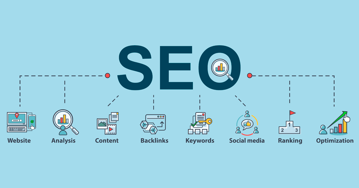
 Search engines, particularly Google, prioritize mobile-friendliness as a significant ranking factor. With the majority of online searches now originating from mobile devices, a non-responsive website can suffer a significant disadvantage in search engine results pages (SERPs). Google favors websites that provide a seamless experience for all users, and responsive design signals to search engines that your website is optimized for mobile.
Furthermore, a responsive website typically utilizes a single URL and the same HTML across all devices, simplifying indexing for search engine crawlers. This unified approach avoids the complexities of managing separate mobile and desktop sites, consolidating link equity and improving overall SEO performance. Investing in a responsive design is therefore a crucial step in enhancing your website’s visibility and attracting organic traffic.
Wider Audience Reach and Increased Mobile Traffic

 The number of smartphone and tablet users continues to grow exponentially. By not having a responsive website, SMEs are effectively limiting their reach to only desktop users. In today’s mobile-first world, a significant portion of your potential customer base is accessing the internet primarily through their mobile devices.
A responsive website ensures that your content is accessible and engaging to this vast mobile audience. By providing a seamless mobile experience, you can tap into this growing market segment, increase your website traffic, and ultimately expand your customer base. Ignoring mobile users is no longer a viable option for SMEs looking to compete effectively online.
Cost-Effective Website Management and Maintenance

 In the past, businesses often opted for developing and maintaining separate websites for desktop and mobile users. This approach not only doubled the initial development costs but also significantly increased the ongoing effort required for content updates, design changes, and maintenance.
A responsive website offers a far more cost-effective solution. With a single codebase and design, updates and changes only need to be made once, and they will automatically be reflected across all devices. This streamlines website management, saves time and resources, and reduces the potential for inconsistencies across different versions of your site.
Enhanced Brand Consistency and Recognition
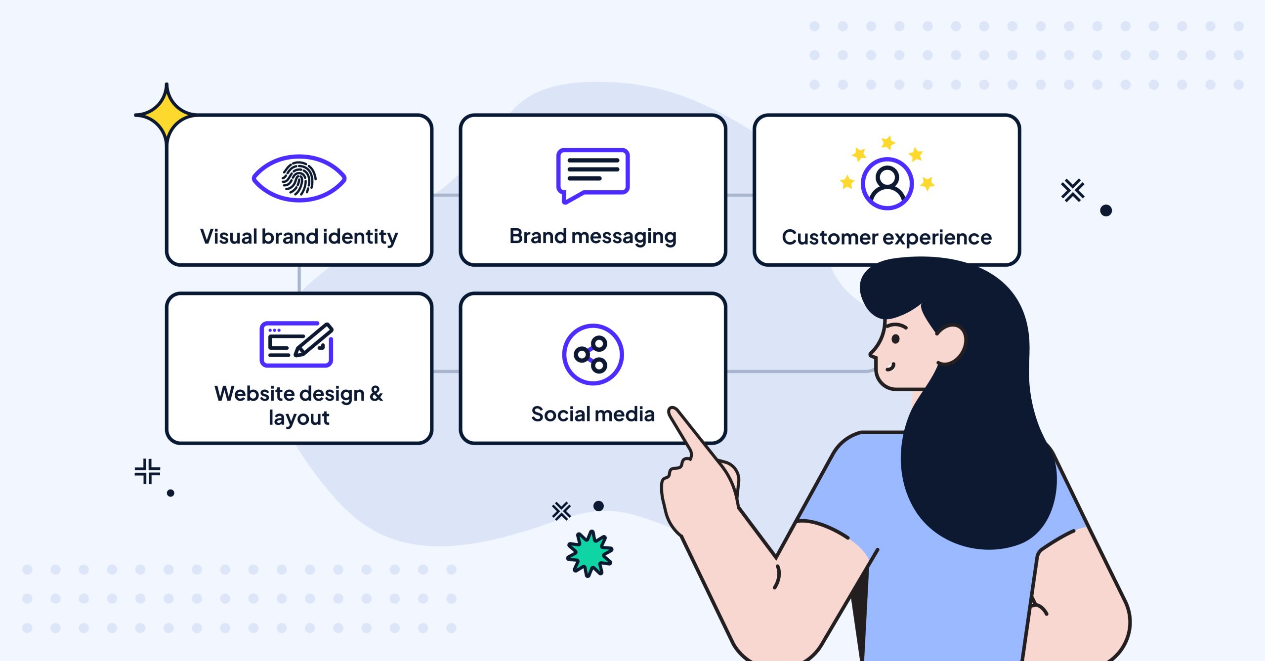
 A consistent brand experience is crucial for building trust and recognition among your audience. A responsive website ensures that your brand’s visual identity, messaging, and overall user experience remain consistent across all devices. This unified approach strengthens brand recall and creates a more professional and trustworthy impression on your customers, regardless of how they are accessing your website.
Improved Website Analytics and Reporting

 Managing and analyzing website traffic from separate desktop and mobile sites can be complex and time-consuming. A responsive website simplifies this process by providing a unified set of analytics data. You can gain a holistic view of user behavior across all devices, making it easier to understand your audience, identify trends, and make data-driven decisions to optimize your website and marketing efforts.
Future-Proofing Your Online Presence
The landscape of digital devices and screen sizes is constantly evolving. Investing in a responsive website ensures that your online presence is adaptable to future devices and screen resolutions. This future-proof approach saves you from the need for costly redesigns every time a new device category emerges, providing a long-term and sustainable solution for your online presence.
Conclusion
In conclusion, the advantages of having a responsive website for SMEs are undeniable and far-reaching. From enhancing user experience and improving SEO to reaching a wider audience and streamlining website management, a responsive design is no longer an optional extra but a fundamental requirement for success in today’s digital landscape. By investing in a responsive website, SMEs can ensure they are providing an optimal experience for all users, maximizing their online visibility, and laying a solid foundation for sustainable growth in the years to come.
At VeCar Digital Programming, we specialize in creating responsive websites that are not only visually appealing and user-friendly but also optimized for search engines and built to drive results for your SME. Contact us today to discuss how a responsive website can transform your online presence and help your business thrive in the digital age.
What are your biggest concerns or questions about making your SME website responsive? Share your thoughts in the comments below!


